Are you entering the same trading session as financial “Whales”?
This article aims to show what really moves prices on financial markets and provides examples of using non-conventional technical analysis in order to get stunning risk/reward ratio per each trade.
1. Setting mind in a right way
If we think about what moves prices on the financial markets, we will find out that it is demand and supply equation. It is formed by the willing sellers and buyers (or bears and bulls) that are making pressure with their orders on price. Once there are more orders on one side, the price will always choose the path of the least resistance. The most important thing is we shouldn’t be interested in how many average income traders are going to take bulls or bears side, because they will never have such a size of account to make price start rally or drop. The only one thing we should concentrate on is trying to identify where corporations, governments, banks and other big “whales” are going to push buy/sell button.
The simple logic here is that being that average trader, the only one way we can make money is to dive with “whales”. Hopefully, they are leaving foot prints on the price charts, and if you know how to use them, you can benefit from market.
Here is a picture explaining bullish candlestick formation for a formal financial instrument “ABC”.
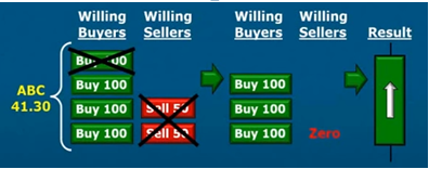
In this example at momentum we have 400 buy orders (4 stacks 100 orders each) and 100 of sell orders (2 stacks 50 orders each). As buyers and sellers meet each other only 100 buy orders (1 stack) and 100 sell orders (2 stacks) are filled. As there are still 300 buy orders and no sellers left, these 300 hundred buy orders are pushing price higher. As a result green candlestick is formed.
Once there is no pressure left from any of the side (bulls or bears), we get an origin of the strong move.
Using order flow for making investment decisions is called supply and demand strategy.
2. Spotting the opportunity
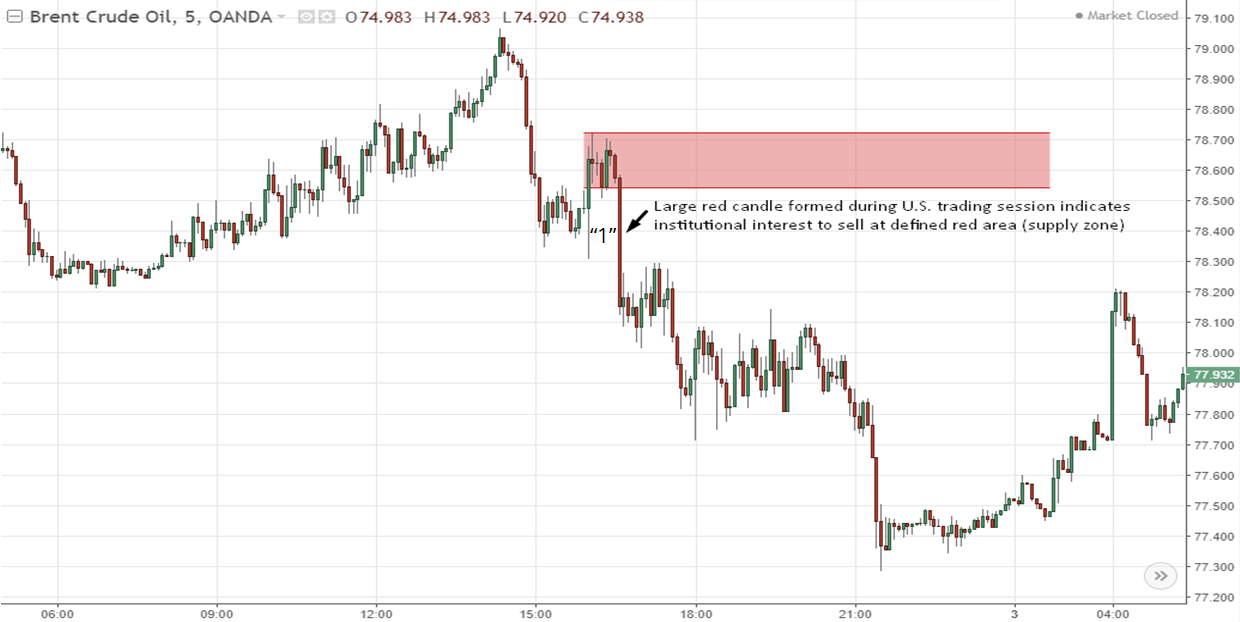
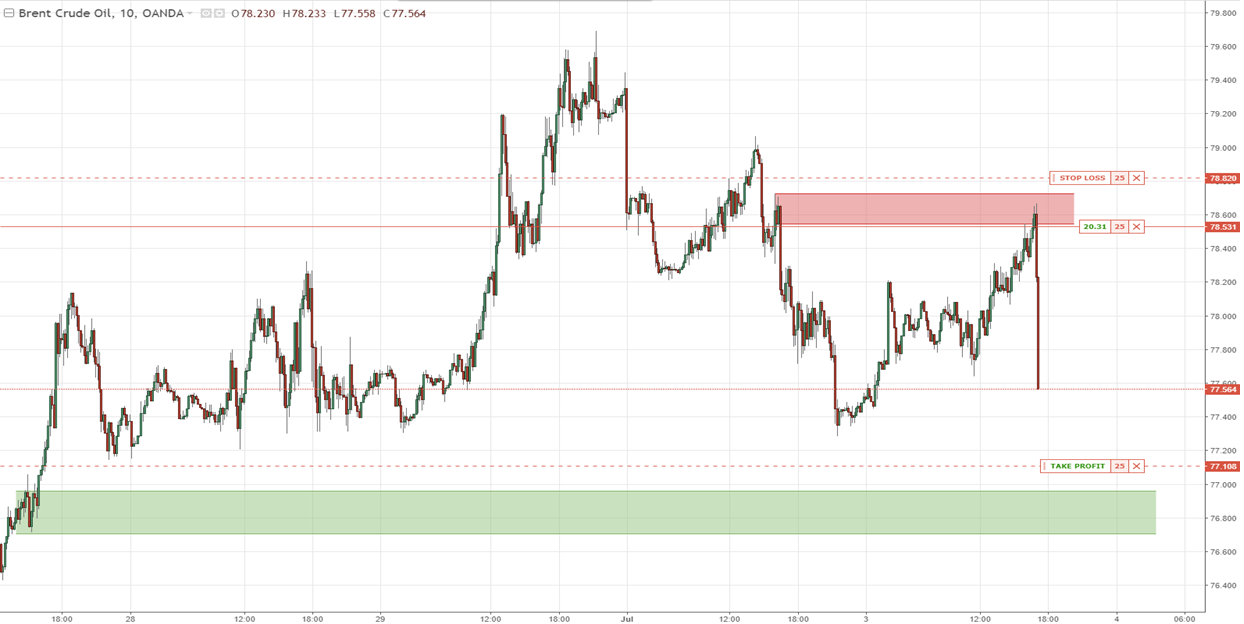
We will use BRENT Crude Oil 5 min chart in order to find out how institutional foot prints look like and how we can use them.
What we can see from the chart is that at some point of time (“1”) there was a rapid decrease in price indicating high interest of institutions for selling Oil at defined red area (supply zone).
Why should we care? We should care, because sharp decrease in price indicates unfilled orders left at the origin of a drop.
Existing unfilled orders are telling us that there was so much interest of selling oil that there weren’t demand orders enough to meet the supply. In other words, someone chose specific price he wanted to sell, let’s say, 5 millions of barrels, but he couldn’t with the lack of buyers, which caused price to fall. Now, when price is lower and orders are not filled, why should the “whale” sell at a worse price if he can wait for the pullback to the origin of a drop and sell the rest of unfilled orders to the market?
Once, he found an area that is indicating unfilled orders of bigger players, he should now think about the settings for his trade.
3. How do I set up my trade?
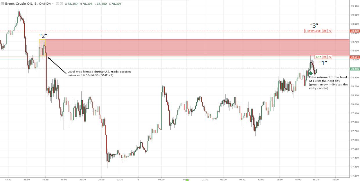
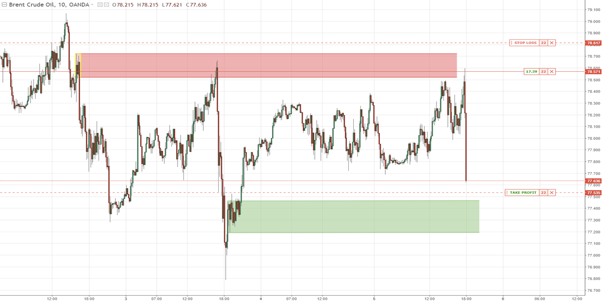
Here is example of the trade above, investor might take part in. The plan was to put limit sell order (“1”) just before the base (“2”, a pause before drop), so that we would be sure we are getting on board with an institutional investor. Stop loss (“3”) was placed just behind the supply zone as if it doesn’t hold, we will have a small loss, which is ok. Take profit order (“4”) may be seen on the next print screen below
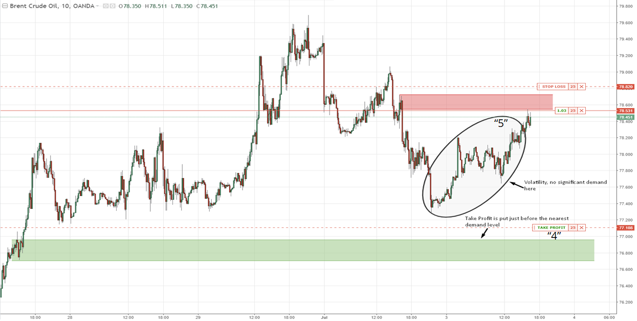
It may be seen on the chart that Take Profit was put pretty far away from the supply zone in the context of a small Time Frame.
Why it was put there? If we take a look at circled area (“5”), which indicates volatility, many books of classical technical analysis would say that bulls and bears were fighting so much there that plenty of support and resistance lines were formed. Hence, in the context of the recent up-trend selling would be a bad idea.
In fact, if we analyze the circled area with supply and demand logic, we will see that there is equilibrium of supply and demand as no sharp moves were created in that area, meaning no unfilled orders left there. Hence, we should expect price to pass this area very confident after the touch of supply zone.
So the questions arises “Where is the nearest opposite area of pressure – area of demand?”. The nearest area of demand (green zone) is lower on the left side of the chart (“6”), where sharp increase in price was formed (unfilled orders) and has not been retraced yet. This is how we made our settings for the trade. Now we have to wait.
4. Time of the trade session
The very important thing to notice is the time the supply level was formed at. It wasformed at 16:00-16:30 (GMT+2), which is U.S. 09:00-09:30 a.m. - first hour ofmarket opening (very aggressive time of placing orders). Another very importantthing to notice is the time price reached our supply area. It happened at 16:00 the next day after level was formed, meaning we were very likely to see sharp decrease in price once it enters the level, because institutional investor would use this opportunity to fill his orders.
5. Taste of victory
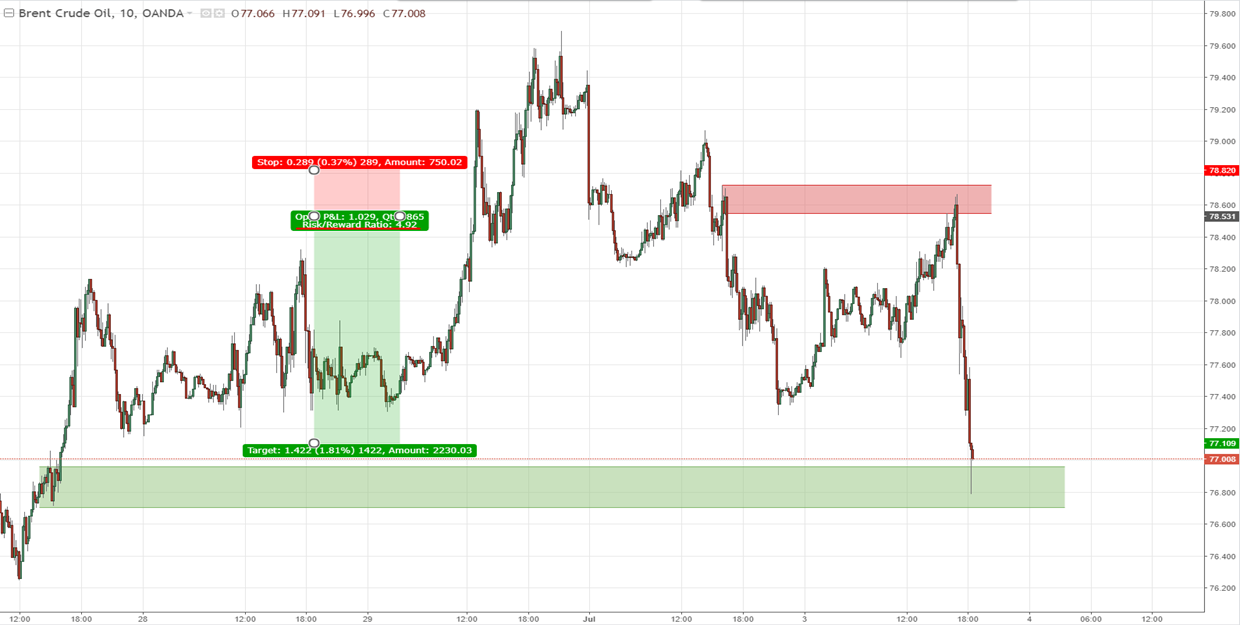
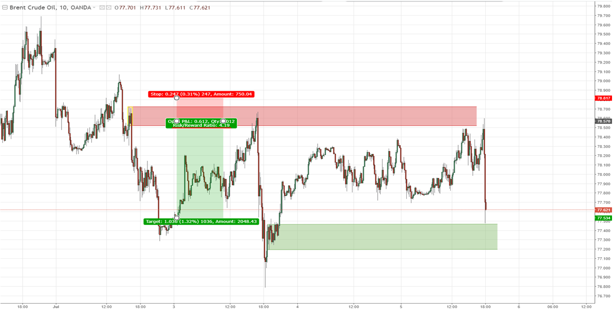
The plan worked. Trade took 2 hours, 15 minutes to complete and provided risk/reward ratio of 4.92 (see the chart above). Meaning if investor puts at risk 1% of capital, he receives 4.92% of capital/deposit growth.
6. There is a level at each corner, but is it good enough?
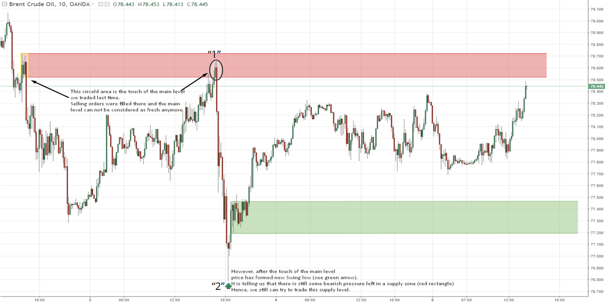
As the 1st trade was completed, a new opportunity was formed for a day trade. As our supply zone was retraced with the last trade, many of unfilled orders of our financial “whale” were filled, which makes supply level weaker. However, after the touch of our level (“1”, see circled area) price has formed a new Swing Low (“2”), which is telling us that there is still some bearish pressure left in the level. Otherwise, how could the price make a new low?
Just like with the previous settings, we need to decide what we are going to do with new opportunity.
7. Setting up new trade
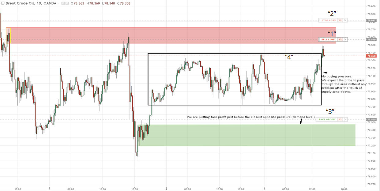
This time (see print screen above) we are putting limit sell order (“1”) inside the zone (because we already know that some unfilled orders were filled and price is more likely to get higher this time), Stop Loss (“2”) just behind the supply zone with the Take Profit (“3”) just before a new demand level formed (green area). Just like in previous example, we expect the price to pass through the volatility (“4”, see black rectangle) as there is equilibrium between supply and demand. Besides, it reaches supply zone 18:00 (GMT+2), which is still morning session in U.S.
After the touch of supply level price is moving confidently through volatility and reaching our target (see print screen below).
8. Is it possible to double account using supply and demand approach?
This time trade took 20 minutes to complete and provided risk/reward ratio of 4.19.
Usually, traders are happy to get 10-12% per year. We did 9% in 2 trades within 3 days.
Hope you will find this article interesting and useful!
Do well by doing good,
27/07/2018
Oleksandr Andriienko
Macte Invest, Business Service Manager
Atgal